Saturday, January 24, 2015

Magneti Marelli Branding

In addition to my day-to-day production duties, urgent fixes and reformatting I've been able to assist and concept new art pieces for Magneti Marelli parts for the better part of 2014.

I was brought on in early August to start doing some holiday designs and artwork for the seasonal campaign after doing some retouching and assistance on third quarter concepts and basic production work on most 2014 Magneti Marelli ads.


Most branding for Magneti Marelli has been word art of different automotive brands overlapped on car parts to represent that any car can be serviced there and that any car can use a Magneti Marelli part. The Holiday concepts are images of traditional Christmas and winter objects with the same brand names layered on them in the steels and blues of previously used pieces.


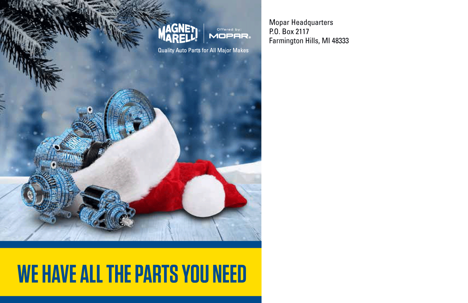
I've done retouching and word art on all works in the project and been able to execute them in all original mail ads. They were so well received that they were requested for poster usage as well.


After the seasonal concepts were finalized new branding tasked us with getting some major ideas down for the next quarter.

I've done drawn some concepts for promoting their oil change services without re-using bottle designs that have been utilized in earlier quarterly promotions. I also worked on retouching and layout in many of the final works.


Depicted are mirror danglers, posters, coupons, mailers and flyers that by now have been printed and are being mailed out to current dealers and customers of Magneti Marelli automotive parts and services.

Wednesday, June 11, 2014

Featured Frames

Many of the automotive dealers we work with utilize the Mopar website. In order to better cater to them we have specific pieces to showcase deals, programs and parts. I've had the privilege of creating a majority of the advertisements on that website while injecting more variety and updating the general look and feel of each ad rather than re-using pre-existing ads with simple copy changes.


Thursday, November 21, 2013

driveSRT Social and Web Landing Pages

Social Media advertising is more of a banner to wave for fans of the company that you're promoting. A website or flyer will try to sell you something. Good Social media keeps their fans informed/interested and proud of their page.

The following are a few pieces both used and unused for the driveSRT facebook page that have gone through the creative system.


A good website landing page catches the user's interest and doesn't impede them from using the website/loading the page. I've been involved in retouching/designing and preemptively designing new landing pages for driveSRT's latest events and products in during the past few months. (Who can really predict the winner of a race? However if it happened they wanted a new page to go up ASAP, which I think is pretty cool.)


Wednesday, August 14, 2013

Magazine Layouts

For the past 6 months or so I've been pulled in and out of production on the ongoing Mopar Magazine for spring and summer issues as an assistant graphic designer. It's been an experience going into images and retouching while also utilizing them for layouts and reincorporating them into multiple pieces.

The magazine has an industrial looks and feel. mostly designed by our lead art director and head creative Jen McMasters. My main job in previous issues was retouching, outlining and reformatting images for use, however a few of my layouts were accepted in the ongoing automotive magazine.

 (Pages 24-25 in the Mar-Apr issue)
(Pages 38-39 in the May-June issue)
(Page 9 in the Mar-Apr Issue)
With multiple events going on for oncoming automotive functions I've been getting put on all manner of different high-detail and multiple-parted projects.

It was fun and challenging getting to design layouts for print, and I am grateful I had the opportunity.

Thursday, August 8, 2013

Dice of March

A while back I was approached by a friend from college about doing a logo design for their new Boardgame Company. I was more than happy to start production and who doesn't like working in Greco-Roman influenced design every now and again?

We narrowed down multiple designs to a more "seal" style of logo with an emphasis on marbled stone.


After applying multiple colors, a more blue and silver color setting was used for the final design. A few minor tweaks to lighten the texture on the skin and make the logo more readable resulted in the final design.
Check out their games and products here:
https://www.thegamecrafter.com/designers/dice-of-march-games

Wednesday, October 3, 2012

Arch Bishop Seal of The Old Catholic Church

I was approached recently by a friend and co-worker of mine Ken Suminksi, to do a seal for Bishop Long of the United States Old Catholic church based off of his original designs and I jumped at the opportunity.

 These designs were done over 20 hours (4 hours each) with minor
changes and revisions until coming to the finished seal below.
It was an honor and great opportunity to do work for an honored member of the Old Catholic Church. This was a fun and challenging piece, all done utilizing photoshop and using vector based art and minor brush techniques.

Wednesday, May 16, 2012

Clubbin Logos


Possible comps for a club-member's logo in a Magazine for motor-vehicle club member's section. These were rejected logos that I felt covered the "Club" atmosphere and rhythms of the electronic based night-clubs that are popular with this generation of music.

Of of my favorite Assignments this year.